I went to design school, so my design process is based on what I learned from there. Which is to say that it is a similar process to most other designers, but there may be a few things I do that are different, so follow along.
If you want to skip to the part where I start using affinity designer, click here. If not, follow along.
In this article I’ll take you through the logo design of a real client: Kode Serve, I worked with them on this project last year (2019), and share with you each step that I took to make a logo for them.
Interview
When a client contacts me regarding a logo design or redesign, it starts with a questionnaire that they answer, which allows me to gather crucial information about their business, what they do, who their competitors are, the design styles or colours they prefer and their needs, etc. I usually follow up with extra non-structured questions to refine the information that I gathered through the questionnaire.
For me, most of my clients contact me through email, or facebook, so, the interview happens via email or chat, and I have a PDF questionnaire that I send over.
Here is a few key information that I gathered from our client for this project.
KodeServe (they prefer to write their name without space in between, ‘kode’ is a code with a k) is a small startup company specializing in web and mobile application design and development. Their target market is small and medium sized businesses. They want a clean and minimalistic design for their logo, an icon that they can use on their website, marketing materials, etc. They don’t have a color preference.
At this point, I also ask the client to show me other brand logos that they like, from any industry, to better help me understand where the client is on with the look they want for their logo. It is important not to use this information as a constraint when developing the new logo, because the client may not always understand what they need. That is why they are coming to us in the first place. So keep an open mind and use their thoughts and ideas if it helps. After all, we want the final design to represent them.
a logo becomes meaningful only after its been used ~ Paul Rand
Research and benchmarking
With the information gathered from the client, the next step is to hop on the internet and find out about similar businesses, look at logo designs on Behance, Dribbble, Pinterest, etc for what is out there already. I create a mood board with colours, pictures, logos, etc for inspiration. Sometimes, most of the time it ends up being a private pinterest board or a folder on the desktop that works as a mood board type thing.
At this point, all I want is to fill my brain with all the information that I need to come up with a great design. Client interview, research and brainstorming steps are for that.
Brainstorm
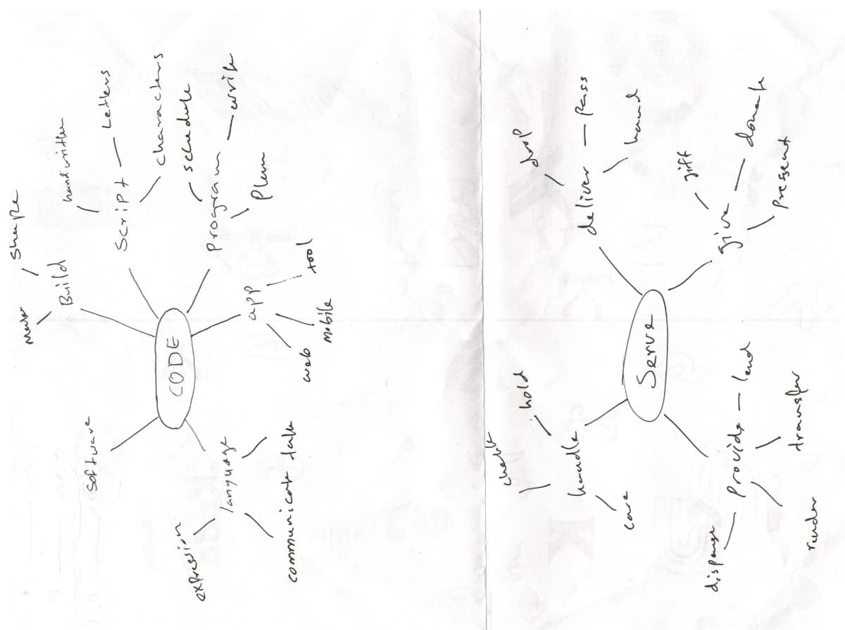
Brainstorming session for KodeServe.
Brainstorming can sometimes give you a few directions to get going with your logo design. I don’t always do a brainstorm like this for every project if I already have a few directions or ideas in my head. From the above brainstorm, which only went three levels deep, I got “characters”, “shapes”, and “expression”, as a good direction to go. Sometimes you may need to do this step again a few times to get good results.
Take a break
I always take a break after gathering all the information and before starting to design. The break could last a few hours or even a few days, which lets the background processes in my brain to kick in and work out solutions. After that, I start sketching.
Sketching
A good logo needs to be three things:
- Appropriate – it shouldn’t say a whole lot. logos should be appropriate in it’s feeling.
- Distinctive & Memorable – It has to be unusual enough to persist in our mind.
- Simple – It should be able to be reproduced everywhere in every size.
~ Sagi Haviv
In the sketching phase, I like to be as distraction-free as I can. I sketch ideas good and bad, everything that comes to your mind. Just let it out. Then refine it a bit, explore a few versions of the sketches that you feel are good, before moving on to Affinity Designer.
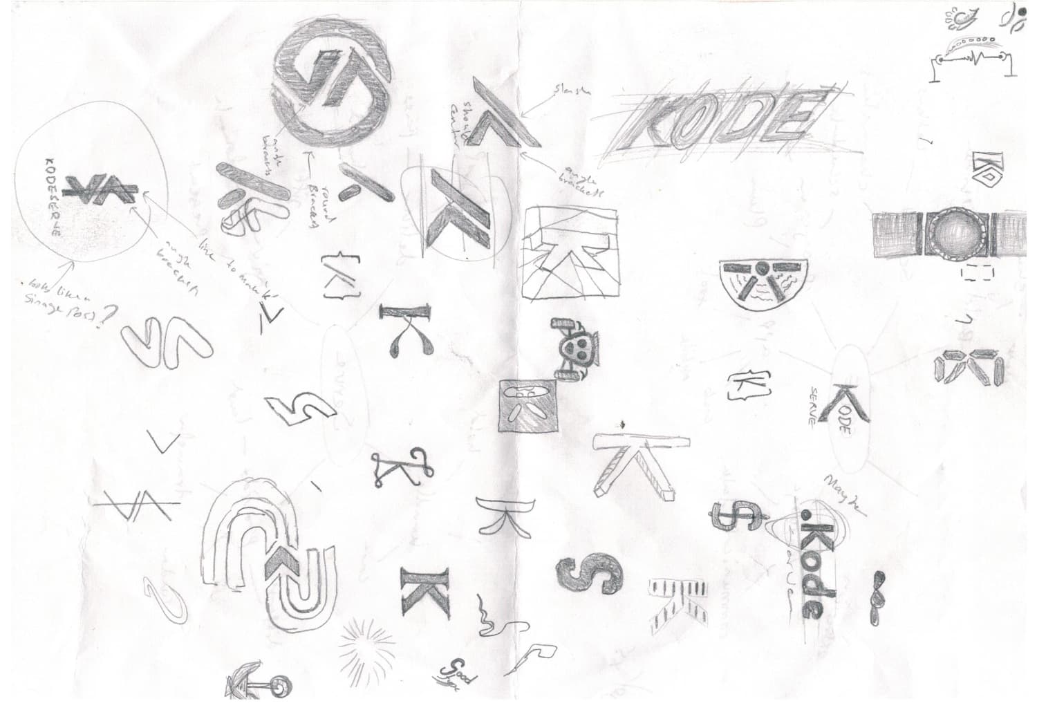
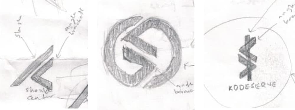
Logo sketches KodeServe.
What I have included above is just a few of the sketches that I made for this project. They are the last versions of the ideas that I thought were good and a few random thoughts. You normally would not be able to get a good logo with just a few sketches you should probably not use the first few sketches, it takes a lot of sketching to get a good enough outcome unless you get lucky.
As you can see, the sketches don’t have to be perfect.
You may have to come back to this step even after rendering a logo if you find out that something that looks the same is already out there in the wild.
Logo on Affinity Designer
To import, I scan the sketches or take a picture and bring it into Affinity Designer to trace over, or just start from scratch and recreate it on the computer.
It is important to note that you have to make sure your design is not too similar to something that is already out there, so once you bring it into Affinity Designer and create your logo, make sure to do a google reverse image search or something similar to see if something similar to yours is there. If the design borrows a few characteristics from other logos, it’s fine, but if it looks almost the same, then start over.
These are the sketches that I thought are good.
Chosen Sketches.
“A logo is not communication, a logo is identification…. a logo is the period at the end of a sentence.” ~ Sagi Haviv
Here is a video clip of me rendering the sketches in Affinity Designer.
At this stage, I usually make a lot of changes to the design. Some minute changes, sometimes it ends up becoming something completely different from what I started with. But for this project, I only did a few changes to refine the design.
Here are the rendered logos.
Three logos rendered on Affinity Designer.
Presentation
I always make a neat little presentation PDF for the client. If I am presenting more than one logo option, I always highlight the one that I think that they should use. The presentation will include black and white logo, colour logo, logo usage examples like the image below.
Logo usage on a wall.
The client will give feedback on the designs, and if you are presenting more than one logo, they will choose the one they like most.
Handover
If the client requires you to make any changes to the logo before handover, you make those changes. For this client, they did not ask for any changes.
Minimum clearance around the logo.
I make a small logo usage guide with do’s and don’ts, minimum clearing, fonts, and colours for the client. Which is included in the handover package. Different formats of the logo like JPG, transparent PNG, PDF, EPS and SVG are also included in the package.
The final logo.
kodeServe Logo.
Thank you for reading.
Hope it was an interesting read.