I will assume that you have atleast a basic understanding of css, and are aware of Tailwindcss. We are not going to explore every class of component in this tutorial, just the ones I think are worth mentioning. TailwindCSS is easy to follow along and understand if you know CSS.
Skip to the end if all you want is to download the template 😅.
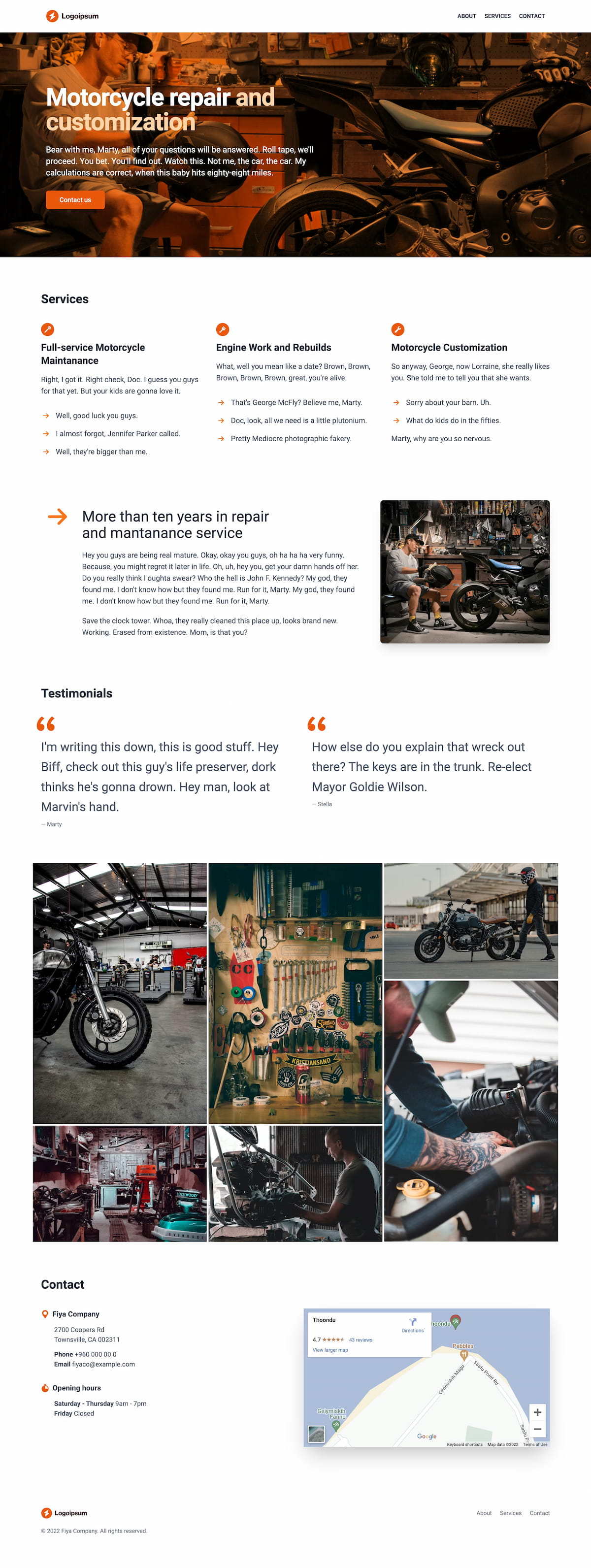
This is the template that we are going to build. You can use it as a profile website for many types of companies and businesses like Motorbike repair shop, Car wash, Barber shop, Laundromat, even for handyman, etc.
Let’s begin. I am using Tailwind CLI tool and npm as my setup for this project. You can do the same by following the installation guide provided by TailwindCSS here., or you can use their Play CDN, which is not recommended for production. Tailwind “v3 version doesn’t have a CDN link like it used to do on version 2”.
Here is what my package.json looks like if you are going the cdn route.
{
  "devDependencies": {
    "tailwindcss": "^3.1.8"
  },
  "scripts": {
    "watch": "npx tailwindcss -i ./src/tailwind.css -o ./dist/tailwind.css --watch",
    "prod": "npx tailwindcss -i ./src/tailwind.css -o ./dist/tailwind.css --minify"
  }
}
If you want to use the Play CDN, just include the script file like so:
<script src="https://cdn.tailwindcss.com"></script>
Let’s get started.
Header mobile menu
<header>
  <div class="flex items-center relative max-w-7xl mx-auto px-4 py-6 sm:px-6 md:space-x-10 lg:px-8">
    <div class="flex-grow">
      <!-- Logo -->
    </div>
    <nav class="hidden md:flex space-x-5 items-center">
      <!-- Menu -->
    </nav>
    <div class="md:hidden text-gray-700">
      <!-- Mobile menu -->
    </div>
  </div>
</header>
Our header has three sections Logo, Menu and Mobile menu. The container div has flex items-center which makes all the sections inline and vertically aligned to the center. We use the container div to give the header sections a maximum width max-w-7xl and align them to the center of the page mx-auto. We can just use the header element as the main container, but have chosen to use an extra div so that we have the option to give the header bar a background color or other styles if we need to later. We could give the bar a drop shadow and background color by giving it classes shadow-md bg-red-100, but we want to keep it white for now.
The logo and menu section are very straight forward so we will skip getting into details on them, lets just head straight to the Mobile menu section. We will be using a checkbox element to show hide the menu — why use javascript when you can just do it this way 😅
We will be using <input type="checkbox"> and it’s checked status to show hide the menu. We will use <label> as the menu toggle button. For this we will use a neat trick in CSS, the general sibling combinator (~). MDN defines general sibling combinator as:
The general sibling combinator (~) separates two selectors and matches all iterations of the second element, that are following the first element (though not necessarily immediately), and are children of the same parent element.
The syntax for for it is former_element ~ target_element { style properties }. An elements state can be used to style a sibling using general sibling combinator syntax. If we have an element input type=checkbox which has a next sibling p we can apply styles to it when the checkbox is checked like so:
input[type="checkbox"]:checked ~ p {
  color: red;
}
TailwindCSS provides peer and peer-{modifier} for us to use general sibling combinator in this manner.
So the above css code can be written as:
<input type="checkbox" class="peer">
<p class="peer-checked:text-red-500">...</p>
Out mobile menu code looks like this using this technique:
<div class="md:hidden text-gray-700">
  <label for="open-menu" role="button">
    <!-- ... -->
  </label>
  <input type="checkbox" id="open-menu" class="peer sr-only">
  <div class="hidden peer-checked:block absolute z-10 bg-white left-0 w-screen top-0">
    <!-- menu content -->
  </div>
</div>
Banner layers
An interesting thing about the banner is we use CSS mix-blend-mode to blend a color layer and the background image. MDN defines mix-blend-mode as:
The mix-blend-mode CSS property sets how an element’s content should blend with the content of the element’s parent and the element’s background.
Here is the structure of our banner
<section class="relative">
  <div class="absolute inset-0">
    <img class="h-full w-full object-cover" src="..." alt="...">
    <div class="absolute inset-0 bg-orange-400 mix-blend-multiply">    </div>
  </div>
  <div class="relative max-w-7xl mx-auto px-4 py-16 sm:px-6 sm:py-24 lg:py-32 lg:px-8">
    <div class="max-w-lg sm:max-w-2xl">
      <!-- Banner content -->
    </div>
  </div>
</section>
What we are doing here is, the container element section has to layers, one on top of the other inside it. To achive this we use relative class, which is CSS position: relative; on the container element. We do this to have the content of the banner on top of the image background.
The first child element is the bottom layer which contains the background image. It has absolute class which is position:absolute and using inset-0 we tell it to take the full width and height of the container element. inset-0 applies top:0;right:0;bottom:0;left:0; styles. The second child elemt of section contains banner content, which is set to relative so that it will sit on top of the background image.
Inside the first element we have our background image included using <img />. We have set it to full width w-full and height h-full. The object-cover class applies css object-fit: cover; to it. The object-fit CSS property sets how the image (in this case) should be rezsized to fit the container element. By setting it to cover, the image maintains its aspect ratio while filling the element’s entire content box, in this case since we have set image height and width to 100% (full), it takes up the size of the container element. Also, cover clipps the image to fit if it does not match the container.
We could stop here and use the banner as it is now, but we are going to add another layer on top of the image below the banner content to give it a nice pop of color. To do this we have used a div element set to absolute inset-0 with orange as a background color, you can use any color you want. Then we apply css mix-blend-mode: multiply; by giving it the tailwind class mix-blend-multiply.
Services bullet point arrow icons
We are using SVG icons as bullet points in the services section. This is done using Flexbox which allows us to display the contents of li in a row by default by applying display:flex using flex tailwindclass.
<ul class="mt-8 space-y-4">
  <li class="flex items-center space-x-3">
    <span class="w-6 h-6 text-orange-500">
      <!-- SVG icon-->
    </span>
    <span class="text-gray-600 text-lg"><!-- Title/description --></span>
  </li>
</ul>
We have the icon and title/description inside of the list item li. We can use the align-items: center; property to align the child elements of the list item vertically to center.
The icon span is set to have a fixed width and height of 24px w-6 h-6 and orange color. We can use fill-current class on the SVG element to have it inherit orange color from the icon element as it’s fill.
By using the tailwind class space-x-3 we can add space between the icon and description.
Photo grid
For the photo grid we are using CSS columns. Which is an easy way to make masonry layouts similar to what Pinterest has.
<section class="w-full max-w-7xl mx-auto columns-2 md:columns-3 gap-1 space-y-1">
  <img src="..." alt="">
  <img src="..." alt="">
  <img src="..." alt="">
</section>
We have set a two column layout for smaller screens columns-2 and a three column layout for larger screens md:columns-3. Since gap only ads space between columns, we have used space-y-1 class to add space between images vertically.
Google maps embed using Share>Embed a map
Google maps has an Embed a map option on Share, which has a fixed width and height which is not good for a responsive layout. We can remove the width and height constraints and use aspect-ratio in the iframe.
<iframe class="w-full aspect-video saturate-50 shadow-2xl" src="..." style="border:0;" allowfullscreen="" loading="lazy" referrerpolicy="no-referrer-when-downgrade"></iframe>
What we have done is given the iframe element a full width and used tailwinds aspect-video which is a nice ratio 16/9 to display the map. Also, I found that the saturation on the map didn’t go well with the layout so used saturate-50 to lower it 😂.
Get it for Free
I have created the home page, and a few other pages which you can download from here.
Its on Github, you can clone the repo instead of downloading if you like. Here it is.
Enjoy!