When I joined the Maldives Pension Administration Office, I had no idea I was about to spend the next year building a full-fledged UI component library from scratch; with Vue, Tailwind, and a lot of trial and error.
At the time, the team was preparing to rewrite an aging pension app that was difficult to use, suffered from poor UX (User Experience), and had a codebase that was outdated and hard to maintain. My role was to study the existing system, talk to stakeholders, and design a new UI (User Interface) that followed UX principles and was intuitive enough that users wouldn’t need much explanation.
Because the app was highly domain-specific, the UX side was particularly challenging. I relied heavily on my experienced colleagues at Pension to understand workflows and user needs. But this blog post isn’t about UX; it’s about the UI components library that emerged as a result of that journey.
I’ve always been more comfortable building UIs directly in code rather than using design tools like Figma or Sketch. So, I started by building the application shell and a few layout components based on what I understood the system needed. There was a lot of back-and-forth with the team, whose feedback was incredibly helpful in refining both the interface and overall experience.
For the stack, I chose Tailwind CSS because it allowed me to build quickly and the team was already familiar with it. Vue.js had been selected as the frontend framework for future projects, and the organization was also moving toward a microservice architecture, meaning the pension system would eventually be split into multiple smaller apps. Since the office already maintained several internal systems, it made sense to build a shared UI component library that all projects could use.
Interestingly, before I joined, the team had already created a Git repository for such a library, but it hadn’t progressed very far. I decided to take that seed of an idea and grow it into something real.
Finding My Way While Building
If I’m being honest, I had no idea where to begin. I had never built a UI library of this scale before; in fact, I don’t think I even realized the scale of what I was about to take on. I did a lot of research (though probably not enough) on things like component naming, folder structure, and architecture.
At one point, after building several components, I decided to add a prefix to all Tailwind classes; which meant updating every single file. Looking back, that was unnecessary for this project and my use case. But that’s how inexperienced I was.
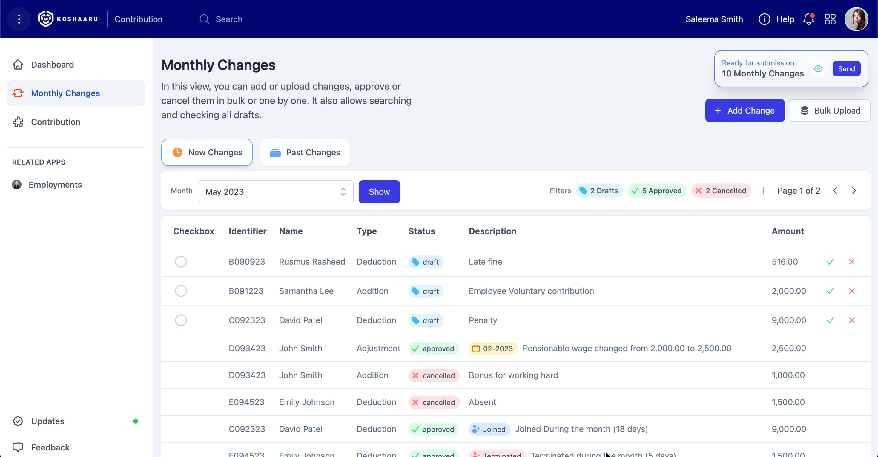
An app layout built with the UI Library
The pressure was real; I had to move fast. The developers were waiting on my UI so they could start building the actual app. Our plan was to create a UI-only MVP (something users could interact with to get a feel for the final product before any backend integration). That way we can catch missing features, or issues early and fix them.
That’s when I came up with the idea for a Nuxt.js project called “UI Lab.” It allowed me to build the entire app UI in one place; fully interactive, visually complete, and with the ability to switch between different “apps” just like in the real system.
Looking back now, that turned out to be one of my best decisions. Since we build many different applications, and I’m the only UI/UX person on the team, UI Lab helped me work much faster. I could design and test new UIs quickly, and developers would get a ready-to-integrate interface they could simply copy into their own app projects.
By the time I formally decided to create a component library, I already had a handful of working visual components. I moved them over, added functionality, and started building from there. The first few components were the application shell pieces (sidebar, top bar, main search, and a few layouts).
From the beginning, I added a prefix to all components, something I picked up years ago when I worked with WordPress. I used “Po” (short for Pension Office) as the prefix. <PoInputField />, <PoTable />. Maybe it wasn’t strictly necessary, but it felt like the right thing to do at the time.
One of the hardest parts early on was deciding which UI elements should become reusable components. I eventually figured it out, though I still have a few regrets about things I never converted. Some of those non-component elements are now used across so many apps that updating them would be a huge task; though I’ve gone back and done it a few times anyway.
Over the past two and a half years, I’ve updated some of the core components two or three times across multiple projects. I made plenty of silly mistakes, but each one taught me something valuable; and fixing them made the library stronger.
Building while learning
Some of my early components were massive. One example was the Page Title component; it did so many things that it eventually had to be broken down into several smaller components. It took me a while to realize that, though. By the time I decided to split it up, it was already being used in two or three different apps.
At that point, I couldn’t just remove its existing functionality; the teams needed time to update their apps. So I had to maintain backward compatibility while showing developers the new, preferred way forward. We made these transitions smooth, thanks in part to being a small team. I honestly can’t imagine how larger projects manage changes like that.
I made plenty of mistakes, especially with components like Input. My first attempt was to build a single input component with a type prop that switched its behavior. It worked, but the component became huge and difficult to maintain. Eventually, I split it into separate components like DatePicker and Select.
Now, looking back, I think my initial idea wasn’t wrong, just my approach. I could have created a main component (say, PoInputField) and then had sub-components for each type. That would’ve kept the code for each input type modular and easier to maintain.
As the library grew and more developers started using it, we needed a way to document the components. Someone from the team suggested using Storybook.js (something I’d never heard of before). It turned out to be a great addition. Storybook let us write documentation and visual examples so I didn’t have to explain component functionality repeatedly.
We don’t use all of Storybook’s fancy features, but the MDX-based stories have been enough for us. They’ve made it easy for developers to explore and understand how to use each component.
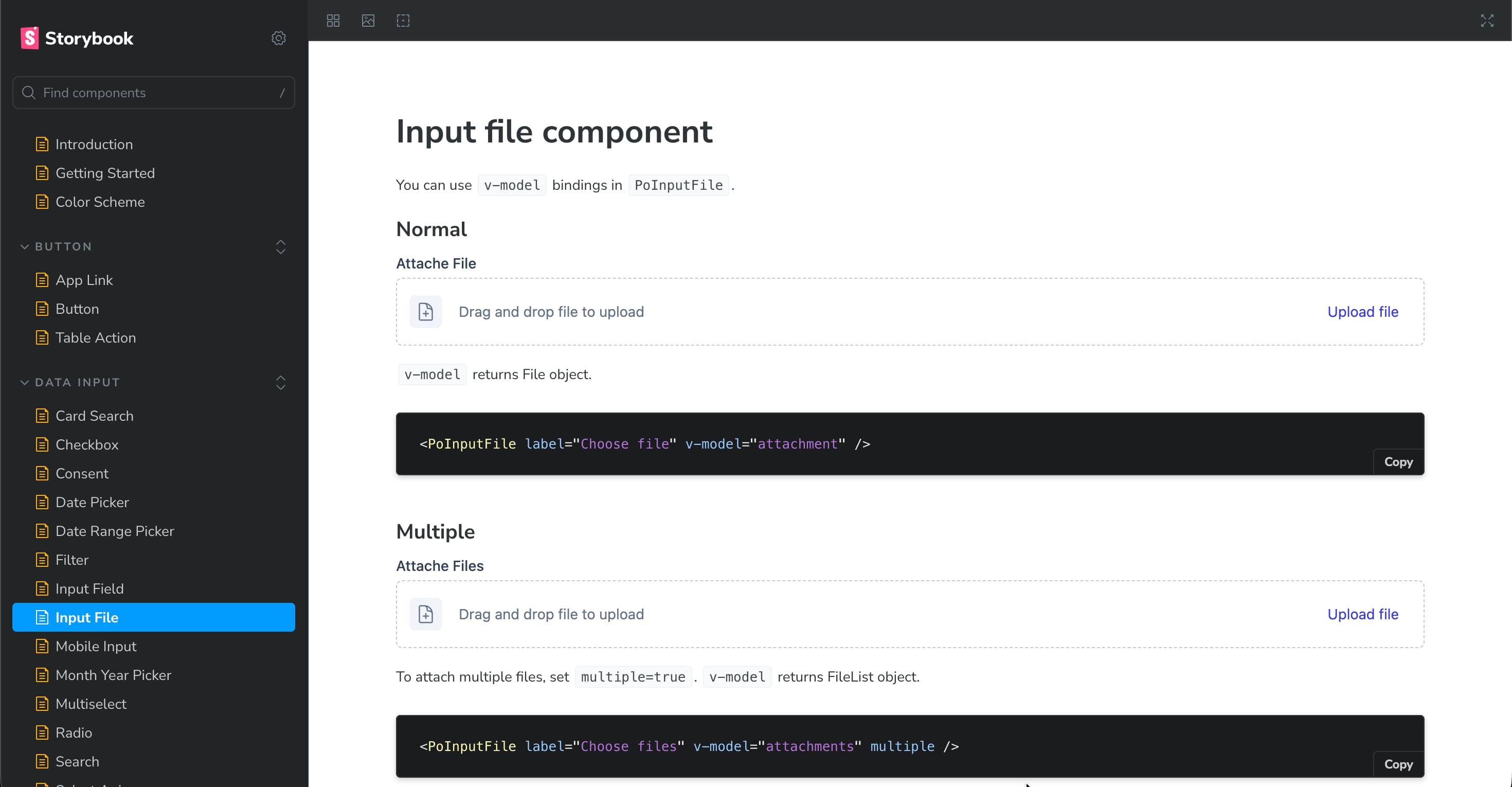
A component's documentation page on Storybook
Later, I got pulled into another project; redesigning the Pension Office website. I was teamed up with a new developer who had a lot of experience with Typescript. He encouraged us to adopt TypeScript, and that turned out to be a major learning experience for me.
Once I got comfortable with it, I decided to bring TypeScript into the UI library too. By then, the library had matured; it had over 50 components. Over the next week or so, I went through the process of converting everything. It was tough, especially getting IntelliSense to work properly in VS Code. I spent hours digging through Stack Overflow threads and trying every possible configuration. Honestly, I’m still not entirely sure which change finally made it work; but it did!
At some point, the team also started discussing unit testing. I had a bit of time on my hand, so I decided to start adding tests to the library; beginning with a few key components and gradually increasing coverage. Now we’re sitting at over 90% coverage.
That said, I still don’t consider myself great at writing tests, and I don’t always trust my tests completely. But they’re there; and that’s a solid foundation to keep improving over time.
When It Became a Real Library
At some point along the way, it stopped being just a collection of components; it had become a system.
In the beginning, there was a lot of back-and-forth between me and the developers. We’d have short meetings to discuss things that were missing or not working as expected (components that behaved inconsistently, or ones that needed extra functionality). It was a constant cycle of fixing, refining, and improving. But that process, though messy, was what made the library stronger.
It truly became a team effort. The developers were generous with their feedback, and together we kept shaping the library into something stable and versatile. Eventually, something changed; the flood of feedback and feature requests slowed down. One day I realized there hadn’t been a single message about a missing feature or broken component in weeks. The library had matured. It could handle all of our use cases, and everyone was happy with it.
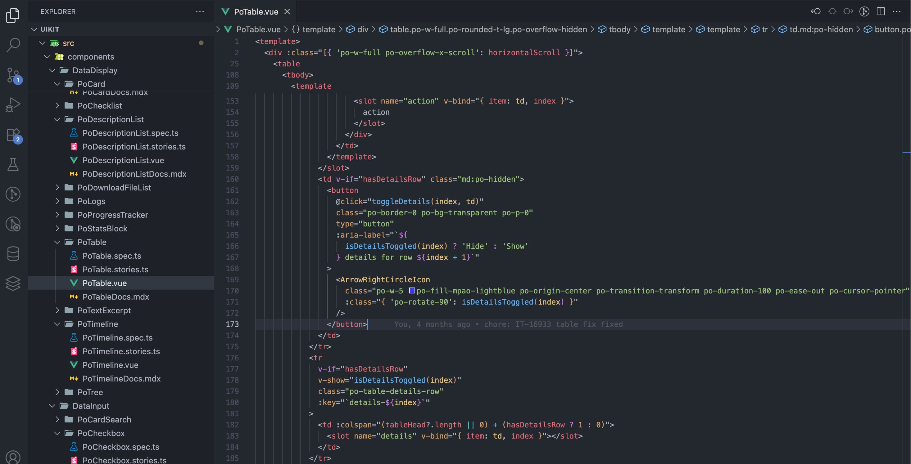
Code
The feedback from the team was incredibly encouraging. Developers genuinely loved using it. A few even suggested publishing it publicly so they could use it on other projects. That was a proud moment (a small sign that the system had grown beyond what it was originally meant to be).
Looking back, I think it would be much faster to build something like this today. When I started, AI tools weren’t part of my workflow. They became mainstream only later, when I was writing tests. I’m sure AI could make the process easier now; though maybe not quite as fulfilling.
To speed up my own workflow, I even created a set of VS Code snippets based on our components. That small addition made UI development incredibly fast and consistent across projects.
The Present – Two Years Later
Today, the library has found its way into more than twenty apps; most of them internal, with a few public-facing ones. Across all of them, there’s a clear sense of consistency. If you’ve used one app, you can intuitively navigate another. It feels like a Pension app (familiar, cohesive, and deliberate in design).
The feedback from both developers and end users has been incredibly encouraging. Developers love how much faster they can move; entire screens can be built in hours instead of days. The time saved in rework and redesign cycles has been significant, especially since we began using UI Lab for early user feedback.
From the user’s side, the improvement in experience is noticeable; smoother interfaces, predictable patterns, and a more polished overall feel.
It’s been almost a year since the last major release introducing new components. These days, updates are mostly about refinement; small bug fixes, performance tweaks, and maintenance releases. That in itself says something: the system has reached a point of maturity and stability.
Looking back, it’s surreal to think how something that started so small has grown into the design foundation for our entire suite of applications.
What I Learned
Start messy, but think long-term. You don’t need to have everything figured out before you begin; in fact, you won’t. What matters is getting started and staying adaptable. A little groundwork helps, but too much planning can hold you back.
Don’t try to build a complete UI library before you use it. That’s a trap. The best components emerge from real use cases (from building actual products, getting feedback, and refining them in context). Maturity comes from iteration, not perfectionism.
If I were to start over, I’d do three things differently from day one: use TypeScript, write tests early, and maintain proper documentation. Adding those later was a huge hassle. They aren’t “nice-to-haves”; they’re essential to scaling and maintaining a system like this.
Above all, I’ve learned that the best design systems don’t come from theory; they grow out of real needs. You learn more by doing than by waiting until you “know enough.” If you wait until you’re comfortable to start, you’ll never start.
Advice to Others
I started really small; just the application shell, because that’s all we needed at the time. Then came another screen with buttons and a table, so I built those. Every new screen I designed called for something new, and each time, I added just what was needed.
It was the same story with the components themselves. The button component needed variants for different styles, so I added them. The table needed a toggleable details row, so it got one. And slowly, the library grew; one real need at a time.
That approach made development faster and more focused. We built what we needed, when we needed it. Nothing more, nothing less.
One more thing I’ve learned along the way: having a good team around you makes a world of difference. People you can go to when you’re stuck, to ask for advice, brainstorm ideas with, or get constructive feedback from; that support system is invaluable. Even if you’re the only one writing the code, you’re never truly building alone.
Looking back, I never set out to build a component library of this scale. I just wanted our UI to be consistent and maintainable. Two years later, it became the backbone of every app we build; and the best teacher I’ve ever had as a developer. It now has over 70 components and a few helper functions.